I spent a couple days with Excel, futzing with John Hopkins data for Covid-19. The result is charts showing per-capita infections for the 90 most populous countries (confirmed cases per 100K people). They divide up fairly neatly into 5 groups.
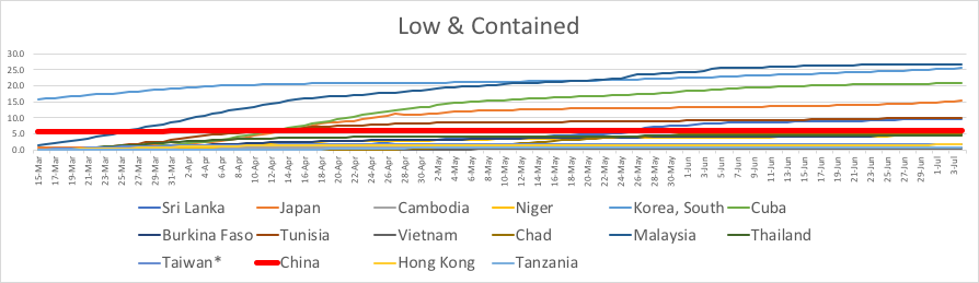
First of all are countries that contained the virus quickly. Except for one city in China, their hospitals were not overwhelmed. Life is close to normal for them, now.
This group is about 27% of the global population, mostly in East Asia. That region had a scary experience with the SARS epidemic, so they knew just what to do for the Covid-19 outbreak: quarantines, contact tracing, testing. Local lockdowns when those weren’t enough. Almost everyone wore masks in public, even before the pandemic. They do help.
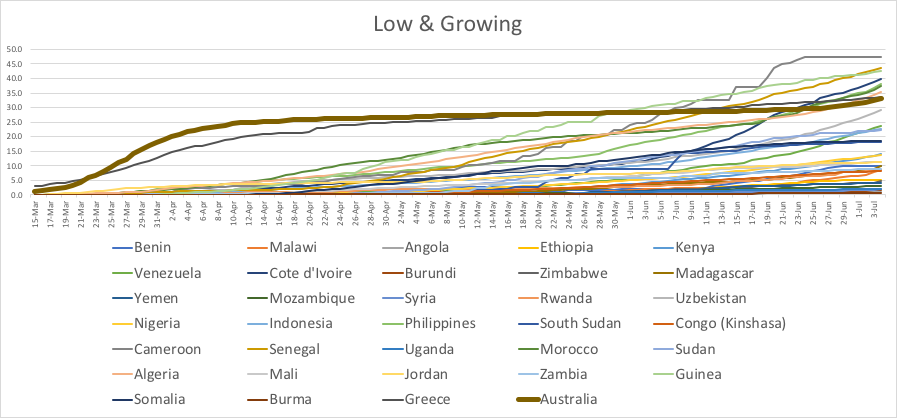
Next are countries with a low rate that is still growing. These are about 20% of global population. Almost all are Third World or close. That means the low numbers could be from lack of testing, rather than lack of disease. Australia (thicker line) is the outlier. They contained the outbreak for several months, but Covid-19 has recently started to increase again. It’s mid-winter in the Southern Hemisphere, which may be the culprit. That will also be the theme for other countries, later.
For the next three graphs, the vertical scale is compressed by 5x compared to the previous two.
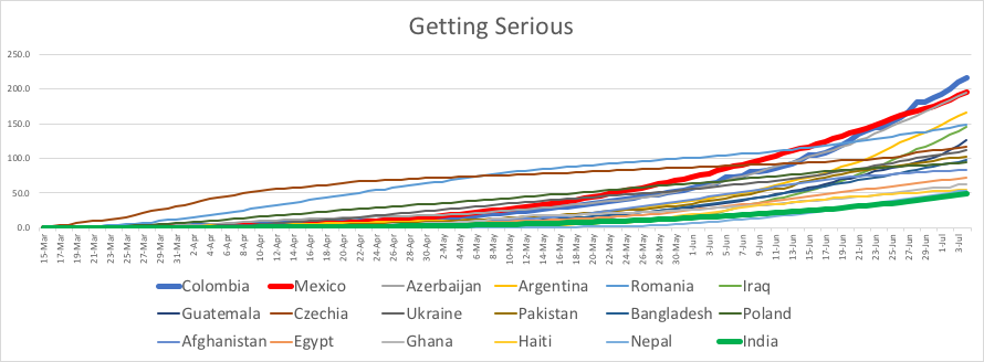
The “getting serious” middle group has exponential growth, with infection rates that are just starting to be dangerous. Columbia (thick blue line) and Mexico (thick red line) are the worst. India (thick green line) is lowest per capita, but it may be under-reported. These countries make up about 36% of global population.
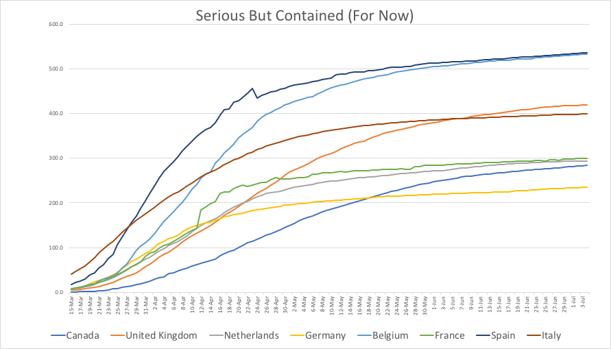
The fourth group had scary rates of infection in March to April, but they are mostly contained for now. Covid-19 snuck up on them, but all these countries responded well. All are First World countries, with 5% of global population.
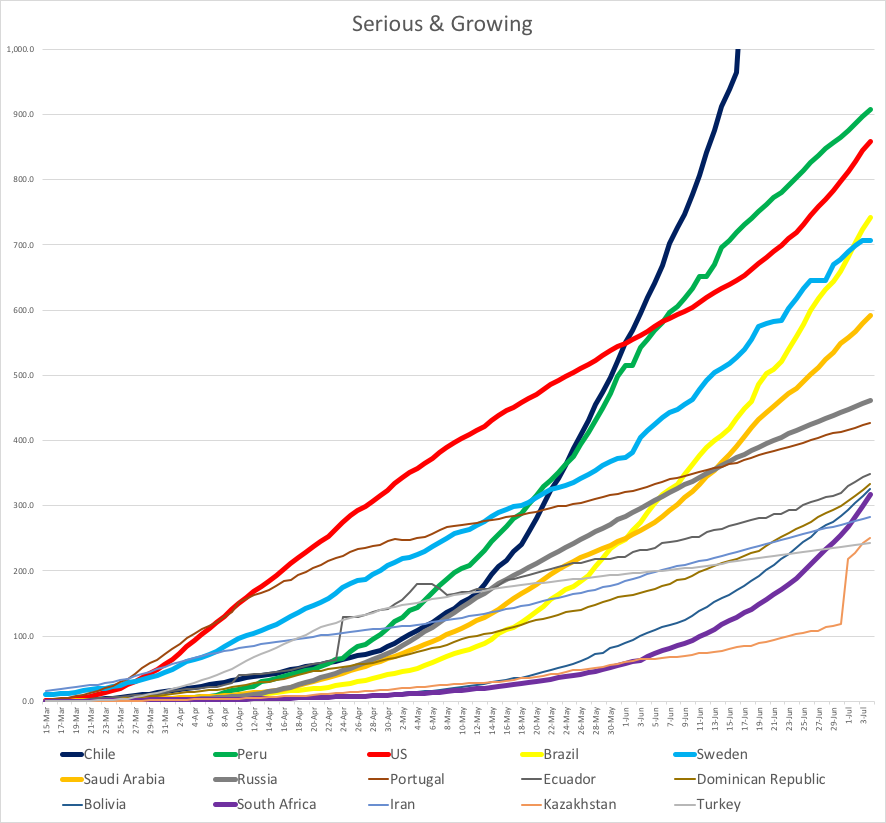
Then there are the 15 countries already facing a serious impact from Covid-19, with infection counts that are still increasing. You might say these are the basket cases.
Worst of all is Chile (black line), which currently has 1,527 confirmed infections per 100,000 people. That’s over 1.5% of their population. It made the graph too tall for WordPress to handle, so I had to cut it off at the top. Peru (green) is #2 with .91% infected, Bolivia is #11, and South Africa (purple) is #12 and growing fast. Argentina is also exponential, but just below the cutoff I used. All five of those countries are in their winter seasons. That probably is a very bad omen for the Northern Hemisphere, looking ahead to Fall.
The next most bad-growing-worse countries got that way because of politics. USA (#3 red), Brazil (#4 yellow), Saudi Arabia (#6 orange) and Russia (#7 gray) all have autocratic rulers who started out denying that Covid-19 would be a problem. When proved wrong, they still didn’t do much to help fix things. Sweden (#5 light blue) tried a bold experiment, and didn’t shut down. They ended up with more infections, and an economy no better off than the rest of Europe.
All this stuff is just numbers, but it represents many people’s lives. Looking at that steep red line for the US makes me very angry, and very sad. How did we fuck up so badly? But I’d better stop now.
Dennis Kolva
Programming Director
TurtleSoft.com


