Covid-19 in Charts (Dec 26)

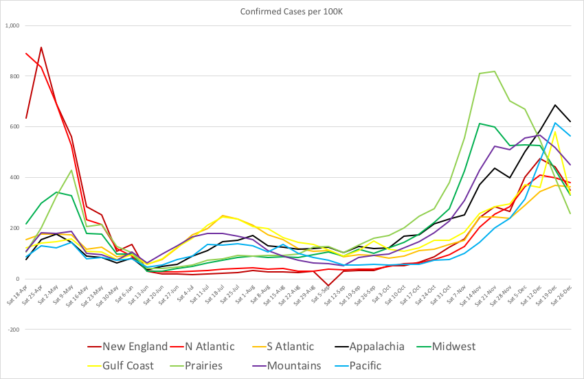
This chart shows new confirmed Covid-19 cases in each part of the US. A couple months ago things got bad in the Dakotas and surrounding states. Then it improved there, but got worse everywhere else. There was a sudden reverse last week. New cases declined in every region. It may be good news, but more likely it’s because health departments ended the week early.

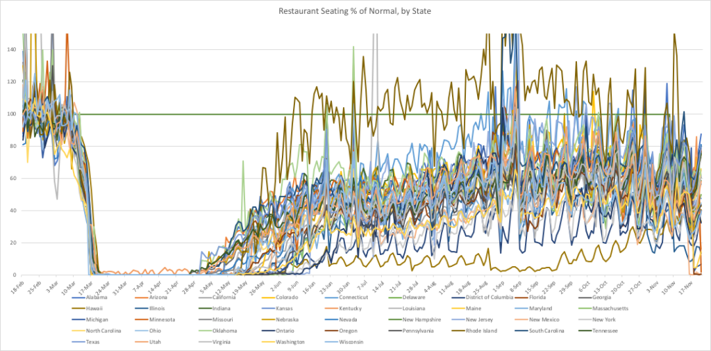
This one shows weekly restaurant seatings from OpenTable, comparing this year to 2019. After the April/May shutdown, it rose gradually to about 60% of last year. Now it has declined back to about 35%. There’s a big spread between states: New York is at 12%, California 6%. Texas and Florida are still near 60%. I don’t know why everyone decided to eat out during Labor Day week.

Last July I divided the largest countries into 5 groups, and made charts for their cumulative confirmed Covid counts. Here are updated global CCCCCCs. All numbers are cases per 100,000 people.

First are the countries that were doing it right back then. Almost all of them are still doing it right. They have very few cases, and economies that are close to normal. The only exception is Tunisia. It’s starting to catch up with Europe.

Next are countries that were just starting to increase in July. Most of them halted the growth, but Jordan, Morocco and Greece are acting like Europe. Some of the poorer countries may have low counts from lack of testing, rather than lack of disease.

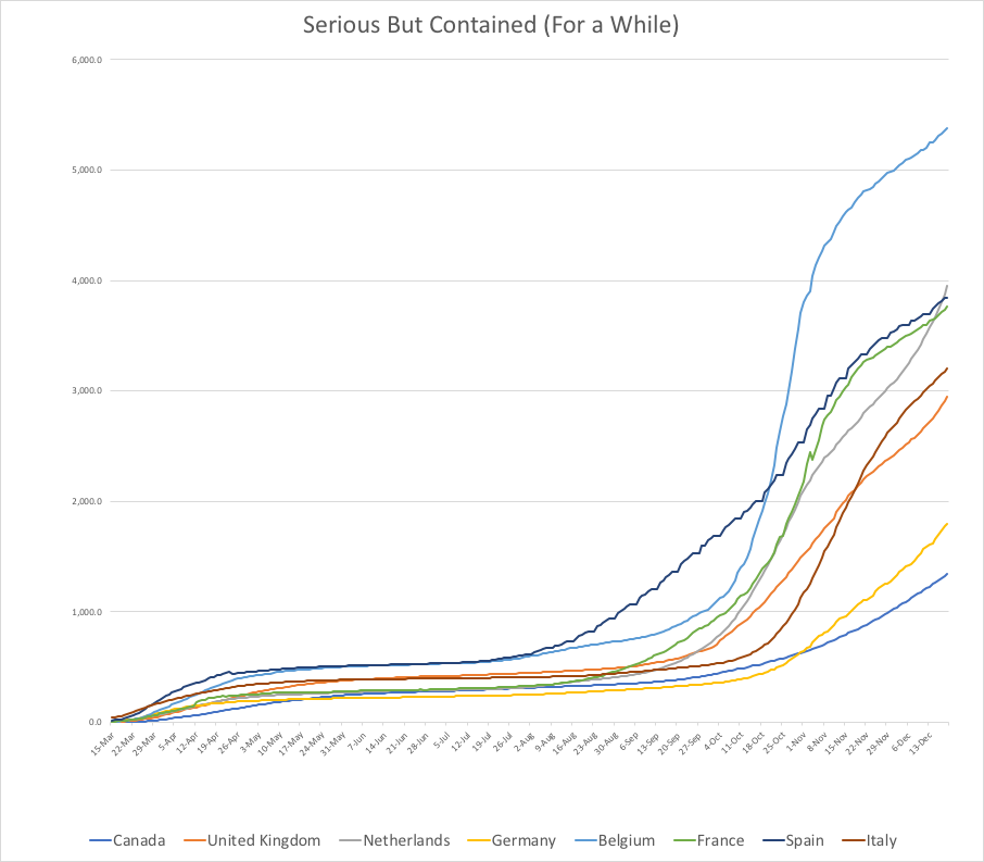
The third group is countries in Europe, plus Canada. They had serious early outbreaks, but contained the disease over the summer. Sadly, things got much worse once the weather cooled. Canada and Germany aren’t too bad, but the rest are doing almost as badly as the US.

The fourth group is countries that were just starting to have serious problems in July. They are a mixed bag now. Some are doing OK, but the ones in Europe and South America have growth rates similar to their neighbors.

The last group I called the “basket cases”, with outbreaks that were bad and getting worse. Those in the Southern Hemisphere slowed down as their summer hit. Those with disease-friendly politics became even more baskety. Portugal started zooming recently, similar to the rest of Europe.

The countries with the most per-capita Covid cases now are #1. Czechia, #2. Belgium, and #3. USA.

About 45% of the world population is in places where Covid-19 is no big deal: China, all of East Asia and Southeast Asia, Australia, New Zealand. A few island nations and isolated countries. When a disease is contained, it’s possible to keep it that way. Though it’s much harder when neighboring countries don’t have it under control.

About 5.5% of people in the US have been infected so far. Keep in mind that it takes roughly 80% to reach ‘herd immunity’. Take the pain of the past 10 months and multiply it by 15 to get there naturally. It’s why we need vaccines.

Dennis Kolva
Programming Director
TurtleSoft.com

The Economy (Dec 2)

TurtleSoft was born near the end of the Reagan presidency. Those were the days of “trickle-down” economics, with a top income tax rate of 28%. It had fallen steadily from 91% in 1963, to 70% during the 1970s, then to 50% and down during the Reagan years.

I read an article back then predicting that the new tax policy would shrink the US middle class. They expected good fortune for Walmart (more poor people) and for Tiffany’s and Neiman-Marcus (richer rich people), but problems for Sears (bye-bye middle class).

At the time it seemed like a bold prediction. But 30+ years later, the writer turned out to be spot on. Sears is almost dead. Walmart is thriving. Aside from Amazon, their biggest competition these days is the dollar stores, which cater to even poorer people. Tiffany’s and Neiman-Marcus are in trouble right now, but that’s mostly because the Internet and Covid-19 zapped walk-in retail. Or maybe it’s because the moderately rich are also shrinking. The ultra-rich can buy islands and politicians (thank you Citizens United vs FEC). They don’t need to show off with jewelry or designer clothes.

The divide keeps growing, with fewer in the middle.

Covid-19 is definitely impacting the economy very unequally. It’s accelerating a trend that was already moving at decent speed. This is a very bad time to own a restaurant, or any type of walk-in retail. It’s difficult for most service professionals. AirBnBs. Much of the gig economy. Even hospitals and medical workers are worse off: higher expenses, layoffs, and less profitable work.

Construction seems to be a mixed bag. One of my neighbors is a contractor who has kept busy since May. However, the biggest construction project in town finished last month after many delays, and it is still completely empty. Nobody wants to rent offices or apartments in a building with shared hallways. The second-biggest project shut down in April, and it is still just a partly-finished foundation and elevator towers. That’s got to be hard on owner cash flow.

I’m no economist. But as a small business owner and a developer of accounting software, I do know how to track money. As the pandemic slithers into its scariest phase, I think the US is at a crossroads.

The conservative viewpoint is that the deficit is huge, and it’s time to cut back. Based on past history, that usually leads to austerity, layoffs, bankruptcies, deflation. Money stops flowing, so it becomes more valuable. Recessions are a good chance for people with money to pick up assets cheap.

The liberal viewpoint is that people are hurting and need financial help. The US can borrow at close to 0% interest. The economy needs stimulating. Stimulus makes things better in the short run, but the debt eventually needs to be paid to those who provided the money. Mostly rich people & foreign governments.

Hopefully there is some middle ground, to keep things stable until vaccines are widely available. Then life can get back to something close to normal. If the money goes into things that create wealth in the long run, then it’s an even better investment.

Unfortunately, this year a lot of money is shifting from places suffering from pandemic (US, Europe, India, Africa) to countries that contained the disease (China and East Asia). It’s too late to do anything about that. Wealth is also shifting upwards to rich people, since they are relatively less affected.

Meanwhile, I’m keeping busy, trying to stay middle class. Goldenseal Pro is inching along. I think progress will speed up soon.

Dennis Kolva
Programming Director
TurtleSoft.com

Covid-19 Update (Nov 22)

Our staff is back to working on Goldenseal Pro, though no major progress to report yet.

Meanwhile, here’s a chart for new weekly Covid-19 infections in each region in the US:

The numbers are from Johns Hopkins University. I multiplied counts for the first few weeks by 5x, because testing was so sparse back then. There’s still lack of testing now, but not nearly as bad.

50 million people are predicted to travel for Thanksgiving, so the curves probably will get steeper.

Covid-19 is now worse than the first surge 7 months ago, but the US reaction is very different. Here’s a chart of restaurant activity from OpenTable. It covers the entire pandemic from Feb 18 until yesterday.

Between March 10 and March 20, every state dropped rapidly from normal to 0% or close. Starting in May, seatings inched back to 50% or 60% of usual in most places (Rhode Island went crazy with restaurant dining, while Hawaii and DC mostly stayed closed). Attendance has dropped off a little in the past month, but many people are still eating out like it’s 2019. Presumably they are doing other things that spread virus, also.

I don’t know what to say. It’s like watching two trains on the same track, headed towards each other. The Coronavirus train is much, much bigger.

Dennis Kolva
Programming Director
TurtleSoft.com

Covid-19 in New York #5: Early Signs (Nov 13)

Here in Ithaca, we just set a record for active Covid-19 cases and people in hospital. Nationally, the US is also setting records. Things are getting worse in every state except Mississippi.

Globally, much of Europe is shutting down. Meanwhile, the US is chugging along about like normal. OpenTable shows restaurant seating declines in a few states, but most are about the same as a few months ago.

Back in March, I posted a link that talked about how fast Covid-19 will hit. It’s worth revisiting, since conditions probably will be like that again, and soon. Except, this time it’s starting from higher ground. Most of the US is headed towards conditions that are similar to New York City last March.

My parents are in a nursing home in Cattaraugus County NY. It’s rural, just south of Buffalo NY. I check their Health Department website weekly, to get an idea of how things are going there. It’s the only nearby county with a write-up on every case: gender, symptoms, how they caught it, why they were tested.

The odds of catching Covid-19 are growing rapidly. It may outstrip the number of test kits (already happening in the Dakotas). So, I decided to put all the Cattaraugus data into Excel (633 cases), then do math on them. The results may be useful for anyone trying to figure whether they have Covid-19 or not.

60% of Cattaraugus cases are female, 40% male. 20% are health care workers or employees in hospitals or group homes. 47% reported close contact with a Covid-19 carrier. They may not have known it at the time. 8% caught it while traveling elsewhere. 92% were local transmission.

34% had no symptoms when tested (they may have developed some later).

On average, the other 66% reported 3.21 symptoms each. The most common were fever (43%), coughs (43%), congestion (36%), body aches (33%), and headaches (31%). 21% had loss of taste and/or smell. That’s the only one that is different from a bad cold or the flu.

14% had shortness of breath: the most scary sign, since most deaths are caused by respiratory failure.

Victims also reported the usual stuff: fatigue, sore throat, chills, runny nose, nausea, diarrhea, sinusitis, weakness, dizziness, chest pains, stomach pains, vomiting. Sneezing was rare: only 3 mentioned it.

UPDATE NOV 22: Cattaraugus had 52 positive tests on Nov 17. Then 30+ most days after that. Not surprisingly, they stopped listing details for every case and just give a summary now. I revised the percentages slightly, with a few days more data.

If you want one more way to track the pandemic, Carnegie-Mellon now has a website with Covid-19 maps. It uses Google and FaceBook data to track doctor visits, mask usage and other indicators.

Back in March, people changed their behavior very quickly. It happened in just a week or two, even before Governors shut down states. I’m curious to see if it happens again.

Dennis Kolva
Programming Director
TurtleSoft.com

Health Departments & Politics (Oct 21)

I’ve been more than a bit obsessed with Covid-19 since it started. For a while it was almost a full-time gig. These days it’s calmed down to just a few hours a week: reading science papers, and spot-checking a few websites.

Among them are sites for Health Departments in some nearby counties. They vary. All have current numbers, but some break it down by towns; some give a brief description of each case; some have lists of places where infected people visited. Right after the Sturgis rally, Cattaraugus County (4 to the west) even mentioned that two cases were in people just returned from South Dakota. That’s a long motorcycle ride.

The sites are entertaining, in a geeky sort of way. I keep adding more counties, and now visit 15 of their sites. Reading between the lines, they paint a picture of what the pandemic must be like for staff in local Health Departments.

Pre-Covid, their biggest job was inspecting restaurants and other food services. Keep perishables below 45° or above 145°F, don’t put meat above salads in the fridge, control rodents and the like. They also administered WIC, and tried to keep people from catching STDs or growing too obese. Flu shots. Toxic algae blooms. Ticks and Lyme disease. Mosquitoes and West Nile. Opioids. Tobacco. Rabies.

Most of these departments are pretty small. They already had a lot on their plate. This year they’ve been in crisis mode for seven months already, and the battle has just started.

Contact tracing and quarantines are an important part of controlling a communicable disease like Covid-19. That’s mostly what they do now. I’m sure it is not an easy job. You’ve got to ask people where they’ve been, and who they were close to. Then persuade them to stay home for a couple weeks. Plenty of people resent authority or think it’s all a hoax. Even the best will be tempted to sneak out for a bit. You’ve got to deal with all that, and probably don’t have much enforcement power.

Normally I avoid talking about politics. As a business owner, I’m significantly less liberal than most folks here in Ithaca. As an Ithacan, I’m more liberal than most people using our software. It’s not worth arguing about.

Thing is, right now the US probably is headed into a major emergency. A once in a century situation. It’s right in the middle of an election for President, all of the House and 1/3 of Senators. Plus local races.

Both political parties got together in March, and signed the CARES act to support people and organizations affected by the pandemic. Since then, it’s been gridlock and antagonism.

All those local Health Departments will make the difference between a moderately bad Fall/Winter season for Covid-19, and a runaway disaster (or lock-downs and economic damage). To keep everyone safe, they need more staff to trace contacts. More tests. More resources to support folks in quarantine so they don’t wander off and infect others. Problem is, the states and counties that pay them are facing bigger expenses, and reduced revenues. They can’t print money to make up the difference. They need help.

And of course, many individual people are in the same boat. Life got a lot more complicated and generally worse in March. It’s not turning any corners, anytime soon. It will take extremely competent leadership to manage the next phase of the pandemic, and recover from the economic damage. States and counties can only do so much. Covid-19 is exactly the kind of problem that needs full attention at the Federal level. It’s not happening now.

You might say this country needs to come together to fight a common enemy: the coronavirus that causes Covid-19. And maybe come together for other stuff also. Life was already headed downhill for many people, even before March 2020.

I miss the days when there were liberal Republicans and conservative Democrats. When politicians compromised and solved problems (at least some of the time). Voting in a politician is a lot like hiring an employee or subcontractor. In the end, competence and integrity are what counts.

Dennis Kolva
Programming Director
TurtleSoft.com

Covid-19: Contact Tracing (Oct 12)

Our county had its first death from Covid-19 today. The number of active cases has gradually increased as well. Surprisingly, Cornell is not to blame. They’ve only reported 5 new cases in students and staff during the past week. The rest of the county had 30.

This is not just a local problem. Some parts of Upstate NY have even bigger increases. There currently are 226 active cases in Steuben County (2 to the west of here). 870 people are in quarantine (almost 1% of their population). It’s much worse now than in March/April. So far 60 people have died in Steuben, with 15 in the past week. Their population is similar to here.

New York State is actually doing better than most places in the US. Looking ahead, it makes me very concerned.

It’s possible to divide epidemics and pandemics into three levels of severity.

The best option is full containment. It’s what happened with SARS, MERS and Ebola (twice) in this century. There’s a local outbreak, but medical help rushes in to help the infected. Contact tracers find and quarantine everyone exposed to them. There’s public education, to help folks reduce their risk of infection. Eventually the disease stops spreading. Eventually it disappears.

With Covid-19, some countries have reached containment. China is the biggest example, but most of Eastern Asia is fully contained or close. However, until the disease is completely contained in the rest of the world, they all risk new outbreaks.

The next best option is just plain old containment. It still involves contact tracing and quarantines, to reduce the spread. Still public education to help slow things down. But for whatever reason, the growth rate stays about the same. People keep getting sick, but not at crisis levels. That’s where most of Europe is right now. Ditto for much of the US, especially New England. New York was there all summer, but it’s starting to lose it. Europe is starting to lose it too.

The worst option is out of control pandemic. Contact tracing doesn’t work then, because too many people are infected at once. You can’t keep track of everyone, nor quarantine them all. The disease pretty much runs its course exponentially. Eventually there is herd immunity, but it ain’t pretty getting there.

Influenza did that in 1918 to 1920. Plenty of other diseases did that in prior history. This year it happened for a few weeks in one Chinese province, then in Italy, Spain and New York City. Hospitals are overwhelmed. Almost everything becomes unsafe. Things can get very bad, even when a disease isn’t real deadly. It’s worse when every place is in trouble at the same time.

Steuben may be close to the edge now. They have 15 contact tracers, which means each of them is running daily checks on 18 sick people, plus 40 more who were exposed and in isolation. Things were fine there until Sept 23, then it went off a cliff.

Covid-19 has dominated lives for more than seven months. I think all of us are growing very, very fatigued. The problem is that Spring and Summer 2020 were just Covid 1.0. Best guess is that this pandemic will follow the 1918/9 curve. If so, we’re right at the leading edge of the second and bigger wave.

One big thing we have in 2020 that wasn’t common in 1918 is vaccines, plus the science to develop them rapidly. Vaccines are challenging. The immune system in general is not easy to understand. Luckily, Derek Lowe’s latest write-up on vaccine development sums up current progress. He is a writer for Science magazine, and all his posts about Covid-19 are great. UPDATE: the Chairman of Pfizer also just posted info about their vaccine development.

The short answer is that creating a safe & effective vaccine is a slow process. One probably won’t be ready in time to help with that middle bump (if it happens). But it may reduce the 3rd and 4th ones.

Dennis Kolva
Programming Director
TurtleSoft.com

Covid-19: Droplets (Sep 25)

A couple weeks ago, Cornell University had over 80 active infections, and it was looking pretty dire. Then, the students got scared, and more careful. Last week there were 29 new cases. This week only 5. Someone was hospitalized for a few days last week, but it’s down to zero again. Still no local deaths.

Cornell has already run about 90,000 PCR tests since classes started. Students are tested twice weekly, and staff once. It’s probably not cheap. But, there’s a lot to be said for testing everyone: it nips outbreaks in the bud, and also acts as a reminder that the situation is serious. Having same-day turnaround also helps.

Meanwhile, I’m still doing research for a Coronavirus risk estimator. The consensus now seems to be that most infections happen through the air, so I’ve read a few dozen research publications about droplets and aerosols. The best is a 1934 paper by W. F. Wells. Here are a couple of its charts:

The first shows what happens to droplets that leave a person from talking, coughing or sneezing. Anything smaller than about 140 microns (.14 mm) evaporates, and turns into a floating aerosol. Anything bigger falls to the ground within a few seconds. What that means for Covid-19 is that there are three basic risks:

  1. if you are close enough to someone, you may inhale one of those bigger droplets while it’s still falling. That’s what the 6-foot rule is all about, and the advice to cough into your elbow.
  2. After the big droplets land, you can touch that surface, then transfer virus into your eyes, nose or mouth. It’s the reason for washing hands, and not touching your face.
  3. If you breathe air, you may inhale those small dried-up droplets, which gradually mix into the entire room volume. This is where HVAC comes in. The risk for any space depends on the number of infected people inside and what they are doing, minus air changes and filtration. It’s also why masks are so effective: they block droplets both coming and going.

The second chart from the Wells paper explains why respiratory diseases are more common in winter. People are indoors more, which is half the problem. Even worse, the air is heated and dry, so more droplets evaporate, float around, and end up in noses and lungs.

When working with droplets and aerosols, it’s easiest to do everything in microns (symbol µm, aka micrometers). A micron is one thousandth of a millimeter. It’s about the size of the biggest tobacco smoke particles, a medium-sized bacteria, or the smallest pollen grains. PM2.5 pollution is 2.5 microns and smaller (the most dangerous size because it gets into your lungs easily). N95 masks filter 95% at 1/3 micron size. They hit 99% for both smaller and larger particles. 3M says that’s because the bigger particles are heavy, and ram into a fiber. Smaller ones are extremely light, so the fibers suck them in by electrostatic attraction. 1/3 micron is the sour spot in between. A coronavirus is about 1/10 of a micron.

A few researchers have measured the amount of Coronavirus in mucus and saliva: results range from 12 million to 36 billion virions per cc. It’s simple math to translate that to the amount of virus in droplets of different sizes. As it turns out, a one-micron exhaled particle only has a 2% chance of containing a virus, even at the maximum rate. The bigger droplets that dry up and then float are worse. The maximum size that evaporates in humid air (97 microns) will contain somewhere between 3 and 17,000 virions. The maximum in dry air (172 microns) has 16 to 96,000.

As those droplets lose water, they shrink down to roughly 10 microns diameter (about average pollen size). They become a tiny glob of mucus proteins and passengers, light enough to float for hours, easy to inhale. By the math, those are probably the most dangerous.

Dennis Kolva
Programming Director
TurtleSoft.com

Covid-19 in New York #4 (Sept 5)

There are two colleges here in Ithaca. Both planned to have classes on campus. Ithaca College (the smaller one) changed their mind a few weeks ago. They will be online-only for the Fall semester. Cornell went ahead with their reopening plans, and classes started on Wednesday. The Vet School laboratories are testing all undergraduates twice a week, which sounds great in theory.

Three weeks ago, there were 7 active cases of Covid-19 in the county. A week ago there were 19. Yesterday, there were 70. Most cases happened because students had parties without masks or social distancing. Who could possibly have suspected that might happen? /s

Maybe everyone will get scared, and change their behavior. More likely, there will be enough cases to trigger an automatic shut-down, per NYS regulations. We’ll see.

Meanwhile in the rest of the US, the State Rt tracker shows wavy curves for every single state. Today the majority of states are positive. Sometimes the majority are negative. It seems to vary on a few-week cycle. Back in April I compared state responses to skidding on icy roads. Because of the feedback delay, it’s easy to lose control and end up in a ditch.

Luckily, that isn’t happening with Covid-19. Most states seem to be converging on a Rt value close to 1. That’s probably the ideal growth rate, as long as the case count is low: the best balance between health and economic activity. I guess it also applies to ice and snow: most drivers in the North eventually figure out how to slow down the feedback cycle and stay on the road.

Globally, infections are also at a steady state, with about a million new infections every 4 days. Much of Europe is starting to see early stages of exponential growth, again. It’s going to be a long haul.

I’m still working on an Excel spreadsheet that calculates Covid-19 risk. There are many studies with useful info, but nothing that translates directly into hourly risk. It will require some assumptions and guesswork to get it calculating accurately.

Covid-19 risk is mostly a matter of HVAC. The amount of virus you inhale is equal to the number of people nearby, times the % that are infected, then divided by the volume of air and the number of air changes per hour.

At least a dozen case studies have been published: cruise ships, a Seattle choir practice, a Maine wedding, church events. I have been using Google maps and other sources to estimate building sizes. Air changes is totally a guess.

The biggest uncertainty was expressed best by Dr. Gregory House: “everybody lies”. Folks don’t want to miss work, or they really need a pack of cigs, so they get into public space even though they are shedding virus into the air. Odds are good that they don’t wear a mask. They avoid testing and don’t get into the official data, so the math is more difficult. Everyone’s lives are more difficult.

Dennis Kolva
Programming Director
TurtleSoft.com

Roofing, Risk & Covid (Aug 18)

I dropped out of Cornell in 1971, bought some land, and started doing odd jobs. One of the first was at minimum wage, for an old geezer who hired me to put roll roofing on his gambrel barn. He sat in a wheelchair at ground level and talked me through the whole project, step by step. It was all done on old wooden ladders, with a few patched rungs. I was terrified the entire time. Thinking back, there was good reason to feel that way.

Right now I’m re-roofing my own house. I bought some good fall protection for the job, but then decided even that wasn’t enough. So, now there is a comfy scaffolding platform at the eaves, with safety rails. It’s almost like working at ground level.

These days, the risk that scares me most is not falling and dying. Something less could easily be worse: serious injuries, massive hospital debt, chronic pain, permanent loss of mobility. It’s also a matter of comfort. As a builder/remodeler I often worked on roofs with just a safety rope around my waist. Back then I woke up all the time from falling dreams. Now that I do construction more safely, they are very rare. It’s nice to sleep well at night. Less working at odd angles = less back pain. Thank you OSHA.

BTW someone mentioned the unsafe angle of the orange ladder. It’s a support slide for 17 foot roof panels, raised with a rope winch via a pulley at the ridge. Humans use the 3 small ladders inside the frame.

The same risk calculation plays out for Covid-19. What scares me the most is a long hospitalization, then chronic lung damage and piles of debt. Even a mild case still means two weeks of quarantine, boredom and worry. Masks and social distancing are inconvenient, but much less so than what they prevent.

Many colleges that reopened are seeing outbreaks. Cornell and other local schools still plan to open on-site, so I am very worried about the next few months. It inspired me to start building a Covid risk estimator, using Microsoft Excel. It will help for personal decisions.

The process is similar to construction estimating: break things down into smaller pieces, calculate each of those, add them up. For construction, the components are scaffold setup, square feet of metal roofing, skilled labor. For Covid-19, it’s risky environments, and time spent in each. Add up the construction costs and you get a dollar amount. Add up life in 2020 and it’s an estimate of inhaled virus particles, and odds of getting sick.

Turtlesoft got its construction estimating data from our own projects. Covid-19 will be trickier. There’s a fair amount of useful data out there, but it does not translate so easily into virus per hour.

A basic problem for any estimating system is accuracy. Our construction unit costs were calibrated by matching them to actual costs for our remodeling projects. Then we refined them with feedback from users. For Covid-19, I’ll run it on a few case studies like the choir practice in Seattle, and tweak the values so it hits on the nose for those. County case counts and cell phone location data from the Social Distancing Scorecard will also help, especially from back when nobody wore masks.

This is not a rush project, but it ought to come together over the next couple weeks.

Dennis Kolva
Programming Director
TurtleSoft.com

Covid-19 in New York #3 (July 26)

Upstate New York was doing great for a while. From mid-June until July 9, there were only 1 or 2 active cases of Covid-19 in our county. Most surrounding counties were equally low.

I think people started to think the problem was all over. They visited out of state, and had Independence Day parties without masks or social distancing. As a result, Covid-19 surged back. This past week, the number of active cases in the county has ranged from 32 to 39. It’s almost as many as during the peak in late March. Surrounding counties also have spikes. Oops.

At the peak in March, there were 18 people hospitalized with Covid-19. That dropped to zero, most days in May and June. This week saw a maximum of 4, but it quickly went back to zero. There is much more testing now, so March and April probably had hundreds of hidden cases.

Fortunately, still no deaths in Ithaca and environs. Some nearby counties have experienced 10 to 60 fatalities, especially where the disease hit nursing homes.

On a national scale, the State Rt tracker is starting to show interesting wiggly curves for most states. Growth rates go up, until there are enough cases to make people panic and become more careful. Then growth rates decline, until people breathe a sigh of relief and go back to their old ways. Rinse, repeat.

Globally, cases are exponential again. The number of new daily cases is increasing with the same curve as cumulative cases. That’s how exponentials work.

This disease is not fading away just because the weather is hot. It probably will get worse in the Fall. Many vaccines are under development, but getting a well-tested one that’s both safe and effective is still many months off. So the big question is, how to have some semblance of a normal life as long as Covid-19 is still around?

The IHME Covid Projections site makes predictions for most countries and all US states. It now estimates deaths and infections up until November 1, calculated with and without universal mask adoption. The difference is huge, especially in places that are currently hit hard. Overall I think masks are probably the cheapest and easiest way to reduce transmission, and still carry on economic activity that is as close to normal as possible. There are other options too, but none better than blocking those pesky snot droplets right at the source.

Personally, I wear an N95 mask a lot. Definitely indoors in places with other people. Also outdoors when within 6 feet of anyone who is well-masked. I give 20 feet to anyone bare-faced, or wearing a chin-warmer. I saved seven N95s from a box left over from lead paint removal, and labeled one for each day of the week. They all have an exhaust port, but I put tape over it as a courtesy to other people. After 4 months of use the straps are starting to get ragged, but they still work. Hopefully they’ll last until replacements are back in stock.

Many people around here wear masks, and/or give other people plenty of distance. Unfortunately, there are also plenty of Covidiots who don’t give a crap. I asked one non-masked jogger to give me 6 feet as he charged at me on the sidewalk, and he just ran up close and laughed ha ha right in my face. So now I listen for footsteps and scramble out of the way. It’s safer to walk in traffic, rather than close to idiots/narcissists/sociopaths/whatever.

It’s really too bad that the US recommended against face masks for so long. Too bad that leaders didn’t set an example, for so long. The Feds and most states still haven’t figured out effective messaging, to get people to wear them (and wear them properly). I would suggest pushing a conspiracy theory that Bill Gates has cameras everywhere, and masks are the only way to escape surveillance. Its software uses nose and mouth, so make sure both are covered well.

The only good news is that the US approach is going to be great for epidemiologists. There are 50 different states doing different things, and getting different results. Thousands of cities and counties with assorted rules, and varying compliance rates. It’s going to be incredibly useful data.

Meanwhile, I am still stripping old asphalt and adding new metal roofing on my house. The project just hit 25% completion. I’ve never assembled scaffolding before, nor worked with such long sheets. It’s quite a challenge to remove 3.5 tons of decades-old shingle without creating a mess.

So far I have made almost every possible mistake. I guess that is pretty much how I’ve always learned construction. Or programming. Or anything else in life.

Maybe that’s what the USA also needs to do: make every possible mistake. Then the next pandemic will be easier.

Dennis Kolva
Programming Director
TurtleSoft.com